• Willow Branch Library

    Willow Branch Library

    Project Overview

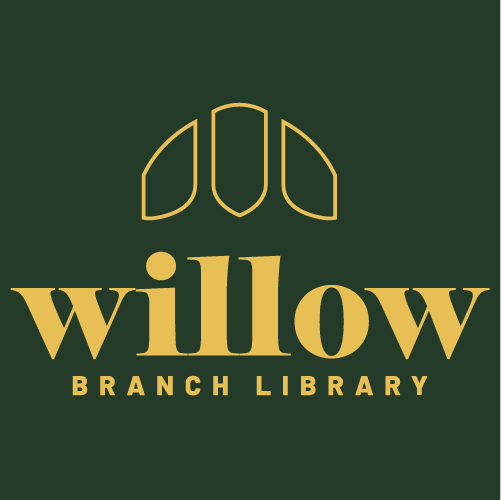
    Lincoln City Libraries is adding to their roster of buildings with a new youthful twist, targeting young adults and teens. Willow Branch Library is an innovative approach to their current libraries, creating a unique environment for the BookTok community to explore their newfound love of reading. New online readers can now enjoy a physical aesthetic place where they can find other readers in their city to bond over trendy titles. They will be hosting book clubs, accept donations, have study spaces, digital media renting, movie room for book adaptation movie nights, tutors and computer labs. Creating a free “third place” community for Lincoln, Nebraska. Along with the addition of The Mill, a local coffee & Tea shop. Willow Branch Library hopes to bring book lovers together and out of their homes. Willow hopes to connect with today’s youth via their own social media page that directs them to their new website. Which will showcase further details of the libraries unique features, rules, online catalog, digital library card and a rental section for digital media or study spaces. With additional library stationary needed for the building and staff,

    Audience Profile

    Willow Branch wants to target those who are on BookTok, a sub-community on TikTok, that helped make reading cool again. These guys scroll through TikTok for hours, finding book recommendations that make their “to-be-read” lists so longer. Making many “fan casts”, hoping to see their favorite books get a movie adaptation. To then end up betrayed when they realize that, the book, was in fact better. Picking apart these movies is their favorite thing, many saying “This wasn’t in the book!” or “I can’t believe they cut this out.” Whether the movie was faithful or not, they will still watch it regardless. These readers end up combining their other hobbies with reading. In ways as creating “fanart” or dabbling in book binding, remaking their favorite books covers. Inspiring to even start writing their own stories. Loving any book section in stores, regardless of how small. To lovely local bookstores and the king of aesthetics, Barnes N Noble. Wanting to rekindle that feeling of going to the library as a kid, the free spirit of just getting to read and adventure within the mind with the words on page. They crave a new place to read, taking their books to parks, the lake, or any event where they might have a bit of time to read, they will. Spewing out annotations on the side with their happy or sad remarks, these guys rather space out with their books then be in the real world.

    Perception & Tone

    The design embodies a book nerd’s Pinterest board dream that showcases aesthetic book nooks with fall weather all over it. A warm forest feeling that invites book readers to come in and read comfortably. All polished with a cleaned-up look that allows space to focus on studying but keeping that rainy cold candle lit feeling.  

  • Efflo

    Efflo

    Project Overview

    Efflo is a gardening company that focusses on reopening the world of home gardening to all. Achieved via their garden beds, tools, and seed packets that are engineered to be accessible for many to use. With their new revolutionary automatic garden bed that rises to the height needed, just hitting the market. Efflo wants to promote said items in todays digital age of technology while still having traditional promotional items. Extending the way their products are accessible to also having their instructions, packaging and wording be easy to understand and to do.

    Audience Profile

    Efflo is targeting the green thumbs of the earth who love to use up every bit of space they have in their garden. Their safe space is their garden and no matter what comes their way they must garden! Some gardeners may find it hard to kneel and be out in the sun for a long periods of time, but even that does not stop them. This can make them out of tune with nature, with their hearts in the garden but not able to go out and do so. Having outside gardeners can help but they like to see their personalized garden created from their own hands. This audience knows each of their plants and has a tight knit bond, seeing them grow.

    Perception & Tone

    The design will be an exquisite rustic feel that emulates the classic good old days of gardening for modern times. Taking back the old-time vintage look, with the twist of modern new technology that feels like a homey generational garden.  

  • Marple

    Project Overview

    Marple is a food company based in Ontario, Canada that is creating the very first new non-sticky maple syrup. Along with several other products including pancake & waffles mixes and jams. Marple is dedicated to producing authentic maple syrup with no additives and designing inclusive products that can let anyone enjoy their products. Marple wants to leave behind the traditional Canadian maple syrup aesthetic and enter the new digital age.  

    Audience Profile

    Marple wants to target those who love to start their day with breakfast. Breakfast lovers know that it is the most important meal of the day. These guys think, what’s the point of breakfast if it can’t be sweet and savory? These guys just can’t leave maple syrup out despite it always being a sticky mess. To the little ones who need to drench their pancakes in syrup that leads to parents with loads of laundry. To finally the sweettooths who don’t want any fake maple flavored syrups, all these guys want the real deal. Breakfast lovers, who sit down to enjoy a quiet breakfast or the go getters of the morning who need their sweet treat of the day. They both want breakfast but without the mess. Parents who can be in either situation with weekend lazy mornings eating breakfast with the whole family to those busy mornings that have you stressed that little jimmy just needs their sweets but is about to get their school uniform into a sticky situation. Everyone is looking for the best alternatives without leaving maple syrup behind. They want sweets and not the mess!. 

    Perception & Tone

    The design will be a new youthful spin on maple syrup that isn’t all about Canada’s stereotypical aesthetic. With a vibrant dramatic abundance of hefty hues taking up most of the design with statements of our messages as well show of HD images of products, the feel of the design will parallel strikingly and stand out in the world of social media.  

    Social Media

    Marple first started out throughout social media. Having a bold abundant aesthetic with HD imagery allows the common internet scroller to look twice and stay and look at Mar Mar’s fun posts.

    To the Store!

    After the crazy rise of Marple throughout social media, they’re coming to U.S stores near you! Here are some looks of how display products and freebies you can get.

    Products

  • The Cat House

    Audience Profile

    The Cat House targets the cat lovers of Lincoln, Nebraska. Staring at the shelter as they drive on O St. These guys always have wanted to come in to look at the cats, adopt or even volunteer. Loving cats, to the brink of crazy cat lady vibes. Cats are their lives, cat print anything to treating their cats with everything. They know that it’s way better to adopt then shop. Encouraging their friends and family to do so. The cat house is important to them because they hate to see any cat get euthanized just because a kill shelter says so. Believing it is cruel. They seek to give back to animals in any way possible, whether that’s donation or volunteer work. In their free time they love to watch cat videos. They say “pspspsp” to any stray cat they see and even set out food for them. They love going to pet stores to see the cats or shop for their own. Are the first to pet the cat at any house party. They seek to have a place where they can just spend time with cats, even if they have one. They believe in them being the best cuddle buddy to read with. Cuddly pets warrants a passive hobby, such as reading. Any free time they have they will also love to sit down and read and having a lovable companion nearby would make it perfect.  

    Perception & Tone

    The design will include a cleaned up take on the current purple of the Cat House identity, introducing more spark into the design as well as hidden cat features throughout. Creating an inviting library that houses cats and invites any cat lover, the cozy feel of being at grandma’s house with warm cookies on a Sunday morning. A jumbled controlled vibrant environment that will get cats out of their shell.  

  • Quill A Victorian Ballroom

    Project Overview

    Quill is a Victorian take on the modern clubbing scene, time traveling to the 18th century bringing back the elegant social gathering of a royal ball for the 20th century to enjoy. Starting in Boston, Massachusetts, Quill has many banquets around the U.S delivering you the demurer way of going out. A more mindful and proper way to meet an elegant suitor, Quill values the tradition of meeting your future partner out in the world rather than a “swipe” away. By remodeling and restoring historical venues in your city, Quill brings to life your Disney or Bridgeton fantasy of going to a royal ball. Transforming commoners to royalty, everyone here is of high status. Quill allows your dream of big ball gowns or handsome suits to be rented to those who cannot get a godmother to grant them a dress from thin air. Quill hosts a variety of themed events throughout the years, from mascaraed, vampire fantasy, regency era and many more. As well as taking suggestions of modern media or different genres of music and twisting it with the Victorian aesthetic. Quill is an adult banquet with a bar but will host kid friendly events such as Princesses/Princes parties, Homecomings, and Proms. Quill provides royal ball dance lessons by day and is an active ballroom by night. With an elite knight force, their top-notch security team, Quill will assure its guests that they can party all night with no jester causing a scene.  

    Audience Profile

    Quill targets those with a creative fantasy mind. Those who love to read and watch historical media. They dream about attending royal balls and reading stories of kings and queens. Wanting to visit real castles and historical places to breathe in the air that was those eras. Historical nerds who know it all, pick apart such media but still love to indulge in it. Have Pinterest boards of “royal core,” something they saw on TikTok, combining years of eras and fashion into one aesthetic since they cannot pick what era they love the best. They eagerly wait for the next renaissance fairs to come to town so that they can live the experience just for a day. This audience is tired of the modern clubbing era and dating apps. They believe they were born in the wrong generation. All this social media weird dating culture makes them upset. These guys are hopeless romantics. They dream of love letters and meet cute. They want to keep a picture of the person they love in a locket in their pocket. They want to experience authentic. They want the Disney classic princess experience. The Darcey’s to their Elizabeth Bennet’s. Anything that Jane Austen has written. They eat it up. They dream of big ball gowns but have no logical place to wear them too. They want their knight in shining armor, and sadly they might find them in some dating app.  

    Perception & Tone

    The design will conduct a Victorian era revamp that mixes in with modern music and social norms. Keeping the classy traditional feel while exploring and celebrating all world history into this one fantasied aspect of Great Britain history. Taking in the vintage classical feel and brightening it with a gleaming cleaned up look.  

  • Chenchita’s Lonchera

    Chenchita's Lonchera

    Project Overview

    Chencita’s Lonchera is a Lincoln based family owned and operated canteen food truck company that offers a Mexican inspired lunch service to construction sites in any city they operate in. The food is a healthy take on traditional Mexican cuisine without leaving out the flavor. With their fast canteen trucks, branded disposable cutlery and salsa bottles, they provide an affordable way to have lunch. Chencita’s Lonchera is further expanding to more cities and to bring in more clientele has opened a new punch card service for regulars and to tie in to newcomers

    Audience Profile

    Chencita’s wants to target the blue-collar workers of cities. The hard workers who build our cities up and love a good homemade meal. For example, Lincoln’s city is expanding more outwards. This creates more job sites with new worker mouths to feed, just like so many other cities around the country. Chencita’s wants to be the equivalent of an ice cream truck that happy children look for, to the workers on jobsites near lunch time. This target audience is tired of finding the nearest fast-food restaurant to get a decent meal and would rather have the deliciousness of Mexican food. Workers who are excited to eat lunch and don’t want to waste one second trying to decide on a place to eat. Fast food is not as affordable is used to be and even less healthy so this audience wants to keep all of their hard earned dollars into a well spent meal. Those who are also thinking of starting to eat healthily can pick Chencita’s as a good alternative to restaurants nearby. This worker audience is strong and knows that they are, which means they know they need a healthy filling meal to keep continuing their hard work. Bringing lunch to work is a thing of the past, since the worker audience is having to come home from a hard day of work just to start packing your lunch for the next day is tiring. This target audience wants that worry gone and so they pick Chencita’s to have their afternoon free to relax.  

    Perception & Tone

    The design will be delightfully cheery and rustic creating the feeling of coming home to a meal after a long day as well as being an eye-catching bold fusion of Mexico’s landscape on wheels from far away. This will make the audience feel like they’re on a true lunch break and with the western tone can bring any customer down south for the real deal.  

  • Rioverde

    Project Overview

    Rioverde was in need a new digital makeover. Inspiration was taken from Rioverde’s Current Letters in its city plaza and turned it into it a modern look. Lacking a unified look between its website and overall city media, Rioverde needed a trust worthy look to not only keep in coming the tourist but also keep the current residents happy.


    Rioverde is a colorful fast city and one color generally could not embody all of it
    without disrespecting the beauty of the place. So existing colors were taken and
    adjusted to be used together easily without trouble of contrast. Orange to
    represent food, green to represent the nature, blue to embody the extreme
    sports (hiking & diving) and finally the pink to represent the culture. Rioverde
    had each of their values representing a letter of the cities name but a lot of
    them generally meant the same thing. Simplifying them down to four helped to
    have organization. Each color can be used in each areas design. With the quick
    busy city, a subtle reference to Mexico’s flag, a golden eagles wings were added
    to the R of the logo. The type is fun even without the color.

    Audience Profile

    Rioverde is a fast-paced city bursting with vibrant colors, situated in
    Mexico. Its letters stand tall, symbolizing its cherished values:
    Extreme Sports, Adventure, Art, Culture, Nature, Fun, Food, and
    Landscapes. However, amidst the thriving tourism industry, unity
    among its residents is becoming increasingly challenging. With new
    logos constantly being introduced and discarded, it’s time for a
    singular, definitive identity for the city to emerge, especially as it
    ventures into the digital era. A unified identity is essential to bring
    together all its people. While tourism is here to stay, Rioverde needs to
    assert control over its narrative, starting with the establishment of its
    own website (which is currently nonexistent). By doing so, Rioverde
    can seize control of tourism, rather than relying solely on platforms
    like TripAdvisor. This not only creates employment opportunities for
    residents but also ensures the safety of tourists and preserves the
    power of the local culture, preventing tourism from diluting its essence.

    Perception & Tone

    This design takes Rioverde’s Letters in its city plaza and gives it a modern look.
    Rioverde is a colorful fast city and one color generally could not embody all of it
    without disrespecting the beauty of the place. So existing colors were taken and
    adjusted to be used together easily without trouble of contrast. Orange to
    represent food, green to represent the nature, blue to embody the extreme
    sports (hiking & diving) and finally the pink to represent the culture. Rioverde
    had each of their values representing a letter of the cities name but a lot of
    them generally meant the same thing. Simplifying them down to four helped to
    have organization. Each color can be used in each areas design. With the quick
    busy city, a subtle reference to Mexico’s flag, a golden eagles wings were added
    to the R of the logo. The type is fun even without the color.

    WHy

    This design reimagines Rioverde’s iconic city plaza letters with a modern
    twist. Rioverde is a vibrant, fast-paced city, and encapsulating its
    essence with a single color would not do justice to its diverse beauty.
    Hence, existing colors were carefully selected and adjusted to harmonize
    effortlessly, ensuring a seamless blend without sacrificing contrast.
    Orange represents the rich culinary scene, green symbolizes the lush
    natural surroundings, blue embodies the spirit of extreme sports such as
    hiking and diving, while pink captures the essence of the city’s rich
    cultural heritage.
    Previously, Rioverde assigned each of its values to a letter in the city’s
    name, resulting in redundancy. Streamlining them into four core values
    brings clarity and organization. Each color can be flexibly integrated into
    various design elements across the city.
    To subtly pay homage to Mexico’s flag and acknowledge Rioverde’s
    national identity, a golden eagle’s wings adorn the ‘R’ in the logo,
    adding a touch of heritage to the bustling cityscape. Even without color,
    the typography exudes a sense of fun and dynamism.”

  • Shark Fest Midwest

    Project Overview

    SCM is a recycled-made jewelry company founded in Minneapolis, Minnesota aiming to bring the Midwest closer to the ocean via its own shark convention event. SCM takes trash from the ocean and converts it into fashionable bracelets that contain a code that allows you to be paired with a tagged shark in the wild. With 35% of earnings also going into shark conservation efforts. SCM values shark and ocean protection above all and the bracelets create a cycle of profits that also go into helping the earth. With their abundance of fame, they want to direct it towards non-profits organizations who take direct action. Their goal is to inform landlocked states about sharks despite being so far away by bringing in experts in the field. Midwest Shark Fest aims to create a fun environment via live speakers that range from serious topics, such as shark finning & overfishing. To more kid friendly ones that bring in shark teeth and life-size inflatable sharks for firsthand learning. The convention will consist of many attractions’ booths with focus information of different topics such as specific species of sharks, the megalodon and other historic shark variants. Different sections of the area will contain selling booths with local artists with ocean inspired items or informational booths with free items to choose from. SCM themselves will have booths as well as Shark Fest itself selling convention merchandise but will not be the focus. Face painting, bouncy houses, crafts, fish touch pools, and mascot meet ups will be available for the kids. Scuba lessons and water sport competitions will be offered for 15+. Shark Fest hopes to create a seasonal event that will create a new mindset over sharks to outcast the negative views the media has put onto them.  

    Audience profile

    Shark Fest targets the shark lovers who live far from the ocean. Distance does nothing to their love. They are eager to see it again. To ease that, they spend time at the nearest aquarium in happiness. They love to watch; they are those who want to do so much more but cannot be on the ocean cleaning it themselves. Despite being far, they are mindful of the waste they create knowing it can get to the ocean one day. Knowing how important the ocean is for the earth and how impactful it is to their lives. They want to have a clean earth for their generations to come. They spend their money on ecofriendly packaged items and donate when they can. These guys get saddened when they hear of another animal getting onto the endangered list and will do anything to prevent that. These shark enthusiasts love to decorate their bathroom in an ocean theme, bringing the ocean any way they can home. In their free time they watch shark documentaries and give their friends and family any shark fact they can. These guys even go as far as correcting their friend when they spread wrong shark’s facts. Their favorite catchphrase is “You’re more likely to die from a cow or a wending machine than from a shark you know!”. 

    Perception & Tone

    The design will be a bright basis feel so that the vendors and speakers can stand out on their own. Even so a spunky energetic kick will be added to its convention items that will make employees, vendors, speakers, and guests differentiated from each other while creating individuality. Painting in the salty oceanic feel of the Midwest.